Face Mask in a Deep Violet Wide-Mouth Jar — A Low Rounded Design with a Silver-Tone Lid
Face Mask in a Deep Violet Wide-Mouth Jar — A Low Rounded Design with a Silver-Tone Lid
Couldn't load pickup availability

Face Mask in a Deep Violet Wide-Mouth Jar — A Low Rounded Design with a Silver-Tone Lid
Development concept: images are AI-generated design references rather than verified stock photographs. Formula, ingredients, texture, packaging materials, net content, benefits and directions remain subject to supplier confirmation. Keep this listing in draft until actual specifications are available.
🎨 The Visual Archive: A New Shape for Face Care
A broad silver-tone lid sits above a low, rounded violet body. The outline is deliberately horizontal rather than tall, with simple FACE MASK wording identifying the proposed category. This concept takes a different direction from a flat sachet: a container-led presentation built around a circular opening, a darker color field and a lighter top surface.
Picture the jar among a small group of personal-care objects on a dressing table. Its wider silhouette can provide a visual counterpoint to upright bottles. That is the design story, not a claim about the formula inside. The final product's performance and suitability must be explained with verified information rather than inferred from its appearance.
Archive A: Silhouette
The white-background view gives the packaging room to stand on its own. The low body, rounded side and broad lid make up its visual identity. A front-facing view keeps the category text visible, while an overhead composition emphasizes the circular geometry.
These proportions are conceptual. They do not establish real measurements, weight or capacity. Before publication, compare the imagery with an actual product sample and replace any rendering that misrepresents the finished container. The wide-mouth description also requires confirmation against the manufactured item.
Archive B: Surface and Color
Deep violet provides the primary color direction. A silver-gray top introduces a cooler contrast without repeating the champagne-tone details of the previous face cream. The pairing is intended to create a clear packaging identity across white-background, detail and lifestyle compositions.
Silver-tone refers to appearance only. It does not establish that the lid is metal, and the violet body does not identify glass, plastic or another material. Color also reveals nothing about ingredients, fragrance or intended skin concerns. Those facts belong in a supplier-confirmed product specification.
Archive C: The Lid Detail
A closer image explores the lid's brushed visual texture and its junction with the jar. This offers another way to present the packaging without relying on a second full-front image. It makes the concept more visually varied while keeping the same container at the center.
A closeup cannot prove closure reliability, an airtight seal, tamper evidence or refillability. The proposed screw-lid format should be checked against actual operation instructions. Do not promise leak resistance, ease of opening or a particular storage life on the strength of a rendering.
Archive D: The Open-Jar Study
The open-jar illustration shows a pale ivory surface with the lid placed separately. It communicates an intended container format, not a verified product consistency. The contents are a visual placeholder and should not be treated as evidence of cream, clay, gel or another formula category.
Before a live listing is prepared, replace this study with accurate photographs of the finished formula. Describe its actual color and texture only when those characteristics are known. Avoid turning an artistic surface into unsupported words such as silky, cooling, fast-drying or deeply nourishing.
Archive E: Three Everyday Settings
A Basin-Edge Composition
Light green terrazzo and a dark applicator create contrast around the violet jar. The scene suggests a personal-care setting, but the applicator and dish are styling props unless the actual purchase specification confirms their inclusion. Their presence does not establish a recommended application method.
A Dressing-Table Arrangement
Mustard fabric, walnut tones and a blue dish give the jar a warmer backdrop. This composition explores how the color palette changes the presentation without changing the core packaging design. It does not imply that the product can be stored under any temperature or light condition.
A Quiet Corner
A turquoise table, coral headband and charcoal cushion create a relaxed visual setting. That scene can support a personal-care story without prescribing a treatment duration. It is not evidence that the mask is an overnight product or that it improves sleep or relaxation.
Archive F: Graphic Color and Texture
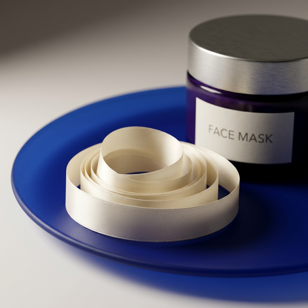
The folded-paper composition introduces brighter lime and coral surroundings, while the texture study uses cobalt to frame an ivory ribbon. These images vary perspective, props and color relationships rather than merely changing the background of the white image.
The texture ribbon remains illustrative. It cannot establish spreadability, absorption, removal method or the finish left on skin. Confirm the actual product type first, then add an accurate texture description supported by the finished item. The packaging alone does not determine whether a mask is rinsed away, peeled off or left on.
From Image to Information: Questions the Final Page Must Answer
What is the actual formula?
Provide the complete ingredient list and identify the intended cosmetic use from supplier documentation. The jar color does not establish a botanical ingredient, and minimal category wording does not confirm fragrance-free status. This draft makes no cleansing, moisturizing, brightening, repairing or anti-aging promises.
How should it be used?
The label should determine application amount, frequency, wear time, removal and precautions. Do not borrow instructions from another jar mask or assume the illustrated tool is required. Any guidance for use around the eyes or lips should be based on the specific finished product.
What exactly is included?
Confirm the number of containers, net content, lid and any included accessories. Props in the gallery should not create an impression that additional items will arrive. Check actual dimensions if storage space or portability is part of the purchase decision.
How should the container be cared for?
Use the finished label's storage and closure instructions. Do not infer contamination resistance, recyclability or reusability from the jar format. If an inner seal or additional component exists, show and describe it only after confirmation.
Release Notes for the Finished Listing
- Replace concept images with accurate representations of the sellable item.
- Confirm jar and lid materials, dimensions and operation.
- State exact quantity and net content.
- Add complete ingredients, warnings and verified directions.
- Support any benefit or certification language with appropriate documentation.
- Separate photography props from the confirmed purchase contents.
A Distinct Container-Led Direction
The violet jar offers a broader, rounder visual chapter after the mint sachet. Silver-gray details, warm wood, textured fabric and bright folded paper give the gallery separate compositions while preserving a single packaging identity. The finished page should retain that individuality and add the concrete information customers need to make a choice.
This draft does not establish clinical testing, dermatologist approval, vegan status, cruelty-free certification, sensitive-skin suitability or environmental claims. Keep it unpublished until the actual item and documentation are available, then replace the development notes with verified product facts.